|
TTASDateEdit |

  
|
|
TTASDateEdit |
|
Use this object to enter any type D (date) field. There are other objects to enter numbers, strings and times.
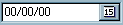
PALETTE ICON & EXAMPLE
PROPERTIES
The following are the properties that apply to this object. Some are defined in Common Properties and are linked to their appropriate page.
Appearance
| Glyph | If you have chosen a custom glyph in GlyphKind below this is where you would choose the .bmp file that would be used instead of the standard ones that come with this object. |
Behavior
Entry
Font
Hint
Misc
Other
| AutoSelect | If this property is checked (True) when the user activates this object, either by clicking on it, pressing the TAB key, or executing the FOCUS command, any Text that is currently displayed will be marked as selected. The user will be able to enter a new value just by typing. If the user wants to start at a certain character they will have to move the edit cursor to that character with the mouse or arrow keys. Default value is True. This can be changed at runtime. |
| ButtonHint | This is the hint that will be displayed to the user when they hover over the button that displays the calendar. This can be changed at runtime. |
| ButtonWidth | The size of the button in pixels. Defaults to 20. This can be changed at runtime. |
| CalendarHints | There are 4 buttons at the top of the calendar that can be displayed using this object. The standard hints are: "Last Year", "Last Month", "Next Month" and "Next Year." You can change these to anything you wish by using the standard Strings Property Editor. Only the first four lines will be used and will replace the default values on a line-by-line change. |
| CalendarStyle | When the user clicks on the calendar button you have a choice of what type of display to use. This can be csPopup (the default value) which displays a calendar attached to the object; or csDialog which displays the calendar in a standard dialog form. |
| ClickKey | Choose the key stroke the user can use to display the calendar for this object. This would be in addition to clicking on the button. The default value is Alt+Down (alt key + down arrow). |
| DefaultToday | If this is clicked (set to .True.), and no previous date was entered, the date will default to the current date as set on the user's system. This would have the same effect as setting the DfltValue to the DATE() function. |
| DialogTitle | If you have chosen csDialog in CalendarStyle above you can specify what will appear in the dialog box caption by entering a value here. The default value is "Select a Date." This can be changed during runtime. |
| DirectInput | If this is clicked (set to .True.), the user will be able to enter the date directly. If this is not clicked (set to .False.) the only way they will be able to set the date value is to choose one from the calendar. The default is checked. This can be changed during runtime. |
| EditMask | This will control the structure of the field that can be entered. An Edit Mask Property Editor can be accessed by clicking on the button in the property field. |
| GlyphKind | This will determine what appears on the button in this object. The options are: gkCustom (this will use what ever you have chosen in the Glyph property above), gkDefault (the default value, displays a small calendar symbol), gkDropDown (a standard drop down arrow glyph), gkEllipsis (a standard ellipsis glyph). |
| MaxLength | The maximum number of characters the user can enter for this object. If you have connected this to a field in your program with the FieldName property then this will be set automatically when the program runs to the size of the field. |
| NumGlyphs | If you have two glyphs that can be displayed, one normally, and the second when the user clicks the button, then this would be two. This is the default value. |
| PopupAlign | If you choose csPopup in CalendarStyle above this will determine whether the popup box will be aligned with the right side of the object (epaRight - the default value) or the left (epaLeft). |
| StartOfWeek | What day will be the first day of the week when the calendar is displayed. |
| Text | This is the alpha representation of the date value. If this object is attached to a field the correct date value is automatically used. |
| WeekendColor | If you want the weekends in the calendar to be displayed with a special color you can choose that here. The default value is Red. |
| Weekends | Choose the days that makeup the weekend. The default value is Sunday only. |
| YearDigits | This is the number of digits for the year value. This can be: dyDefault (depends on settings for the user's locality), dyFour (a four digit year, e.g., 2000), and dyTwo (a two digit year, e.g., 00). |
NOTE: If you are using short (8 character) dates in your program this MUST be set to dyTwo or your dates will not display properly.
Position
TAS Pro
| DfltValue | This value will be inserted automatically into the field if the field is blank when the object is chosen on the form. If you want to use a constant value surround the value in quotes, e.g., '12/01/00'. If you want to use a field, then just put in the field name. The default value is blank. This can be changed during runtime. |
NOTE: You can't use an expression here. However, this is a perfect use of the VALUE option in the DEFINE field command. Just define a field, set the VALUE option to what ever expression you want to use, and put that field name into the DfltValue property.
| FldModified | NOTE: This is a runtime only property and will not show up in the Object Inspector. |
EVENTS
This object has events that are called depending on what the user does. The events are routines in your program that may return a value (generally .True. or .False.) or just alert your program that something is happening. An event looks to your program for a special label. It is made up of the object Name, a period (.) and the Event name (listed below). For example, the Change event below would be: ObjectName.Change:
| Disp | This event is called when the field that is attached to the object is to be refreshed on the screen. This can happen when a record is read, after a calculation, etc. |
| Post | This event is called when the user moves from the current object to another. By default this event will return .True. If you return .False. This will keep the user from leaving this object. This will stop the process from continuing, This can be used to make sure settings are proper after leaving the object. To force the user to stay on the current object, if there is a problem, you may also use the Valid event instead of this. |
| Pre | This event is called when the user moves into an object. If you use this event you must return .True. or .False. when you return (RET) from the routine. If you return .True. the user is allowed to access the object. If you return .False. the object that was active before they got to this object will get the focus again. This keeps the user from accessing an object that you don't want to be active. Commonly used in application where some fields are accessible sometimes (RET .TRUE.) and aren't others (RET .FALSE.). |
The process by which these events are called is:
Pre - This occurs when focus changes to the object.
Post - Called after Valid returns .True. (if there is a Valid event) and before the Pre for the next object.
Disp - Is called anytime the form/object is refreshed.
NOTE: The CHANGE event is not available for this object. This allows the user to enter date values directly. If the entry was checked after every character the user would receive almost continuous error messages.
Page url: http://www.cassoftware.com/tas/manual/ttasdateedit.htm